Web Design Trends 2023
Creating a strong first impression is crucial for engaging website visitors and encouraging their return. Surprisingly, a whopping 94% of those initial impressions depend on your website's design, as WebEx reported. So, prioritizing an appealing and contemporary website design should be a top priority for your business.
Certain web design elements will always be important, such as user-friendly navigation, robust data security, and swift loading times. Meanwhile, when it comes to visual aesthetics, some styles and trends come and go, while others endure the test of time. Regularly incorporating cutting-edge web design trends into your website is a smart move to make your business stand out among competitors.
We've gathered for you ten inspiring ideas and examples based on this year's design trends to give fresh insights and keep your website looking sharp.
1. Complex gradients
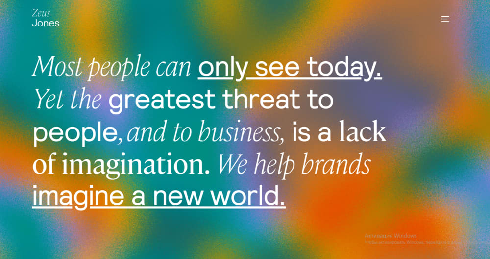
Gradients are a long-time trend that has evolved from subtle color overlays to eye-catching backgrounds. They are essentially color transitions, moving smoothly from one shade to another. It can be a shift within a single color (for instance, light to dark blue) or a transition between two distinct colors (such as yellow to green). Gradients can be used to add depth, serve as a striking background, or subtly add texture to an illustration, making them adaptable for various purposes on a website, whether as a background or a CTA button. Gradients are also a noticeable trend in landing page design.

Zeus Jones, a creative agency based in Milan, greets visitors with a simple black background and the text "Most people can only see today." As you wait, more text appears, and the background transforms into a dynamic blend of black and gray. Finally, as "We help brands imagine a new world." appears on the screen, it explodes into a colorful animated gradient of blue, violet, yellow, and orange. This vibrant opening complements the message, creating an engaging website experience.
2. Modern Nostalgia
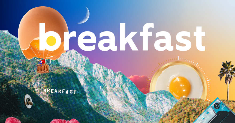
Modern nostalgia design style transports us to the "good old days" in music, fashion, and design. It stirs up fond memories and suggests that creators poured more passion into their work as it was when everything was handcrafted with meticulous care. Despite their retro look, these websites prioritize modern functionality and user-friendly navigation. They incorporate vintage elements like shapes, lines, and textures, often using fonts popular in that era. This results in a design that feels both familiar and fresh as designers experiment with various eras and styles, blending elements from past decades like the 70s and Y2K to create new and exciting designs.

Breakfast, a creative music studio in LA, embraces a '60s retro Hollywood style, paying homage to the Laurel Canyon music scene of that era. Their website features faded sepia-toned imagery reminiscent of old Hollywood photos, coupled with music-themed graphics like an old recording studio switch, an egg resembling a volume dial, and a cassette tape. This blend of retro elements and modern fonts creates a vibrant and fun atmosphere.
- Layered and overlapping elements
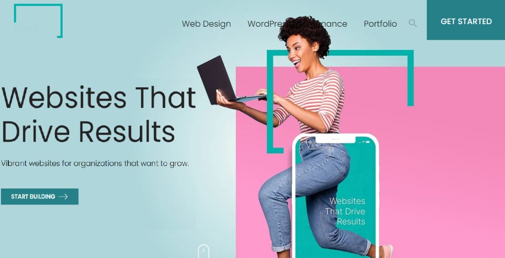
In typical web design, each element usually has its own space, surrounded by empty space known as "whitespace." This design style lets users focus on one thing at a time as they scroll through a website. But, let's be honest unless your visitors are super interested, they might not read everything. That's where visually engaging web design techniques, like overlapping elements, come in. Instead of keeping everything separate, this approach layers stuff on top of each other. Mixing photos and graphics this way can make your website more interesting and creative and even add some fun to regular images. Overlapping text and images has become a popular effect for blogs and portfolios, as it makes the most of the page space. Now, this trend is also making its way to websites, and the current trend is to overlay and overlap illustrations and graphics to give them a playful and dynamic feel.

State Creative's website achieves its captivating design by skillfully layering various elements such as backgrounds, shapes, photographs, text, and mockups. This overlapping effect creates an eye-catching visual experience.
4. 3D design
Flat design, with its standard grids of text and visuals, is used to rule the web as a practical and user-friendly approach. However, web design can transcend this structured format. Incorporating 3D elements into your web design offers a fantastic opportunity to create a memorable and interactive user experience. The 3D design has clear advantages, injecting instant interactivity and intrigue into your design, guiding attention to specific visuals and text you want visitors to notice. It also allows essential website elements like messaging and product details to shine in a captivating three-dimensional experience, surpassing the engagement of traditional flat web design. Remember that 3D websites perform best with fast internet speeds and modern devices; they may not function as smoothly on slower or older hardware. You don't need to create a fully immersive 3D world. Incorporating some 3D elements can still deliver impressive results.

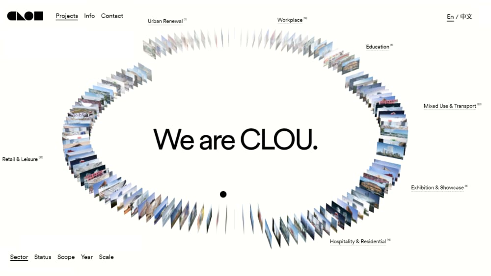
Clou Architects' website showcases their architectural projects with innovative 3D design. The carousel of their works, from workplace to urban renewals, allows you to scroll and select a photo. When you hover over each slide, it shifts and reveals a larger image in the center, accompanied by project details spinning in a 3D animation. This introduction creatively and effectively presents their architectural work in an attention-grabbing manner.
5. Hand-drawn illustrations
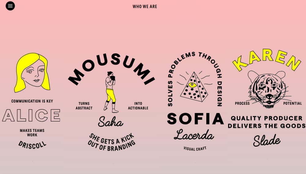
While web design often favors flawless, colorful, and consistent designs, our daily lives are far from perfect in terms of shapes and colors. Hand-drawn elements, such as arrows and squiggly lines, are gaining popularity among brands for their ability to infuse websites with personality and individuality. Hand-drawn elements offer a unique and organic appearance in a world dominated by polished and uniform designs. They can be incorporated into navigation bars, backgrounds, accents, or even form the entire theme of a website, creating a bridge that helps visitors connect more fully with content. They also work well to convey more complex ideas that lifestyle photos can't always capture. These illustrations are often animated to add interactivity.

When you first visit the Worksmiths website, a London-based branding studio, you'll notice a clean black background with white typography. However, as you start scrolling down and delve deeper into this branding studio's site, you'll uncover meticulously crafted hand-made illustrations combined with animation. This harmonious interplay of hand-made illustrations and carefully chosen colors makes the Worksmiths website not only visually striking but also a true work of art.
6. Brutalism
Initially an architectural style emphasizing minimalism and structural materials over conventional aesthetics, this style has also found its place in web design, focusing on functionality and simplicity. Brutalist web design has gained popularity due to the increasing uniformity of modern websites. It incorporates bold imagery, strong color contrasts, and unconventional visuals to offer a distinctive user experience. Brutalism in design is known for its raw, unfinished appearance, which can be seen as cold but powerful. Pursuing a brutalist design can be risky, as it's quite niche and won't be liked by everyone. It is an option for your website if you want to make a bold statement with your design.

Studio Brot, a German creative agency, offers a great example of brutalist website design. Their site blends minimalism with a touch of fun and quirkiness, adding personality. Explore the engaging cursor effects and clever motion elements that enhance the raw feel. As the studio says, "It's not perfect, it's us."
7. Bold Minimalism
Bold minimalism is a design style characterized by clean, simple lines and shapes. The focus is on functionality, so decorations are kept to a minimum. Generally, bold minimalism takes one of two approaches: either everything is pared down to the essentials, or a single dramatic element is used to add visual interest. The key is to simplify the user experience, making it easier and quicker for visitors to grasp your content and make decisions. Usually, this approach is achieved by reducing visual clutter by concealing non-essential elements, like secondary navigation items, through techniques such as off-canvas menus, employing visual hierarchy, and using size, color, and contrast to prioritize elements by importance. Put your most crucial content first to guide user focus. Lastly, limit user choices.

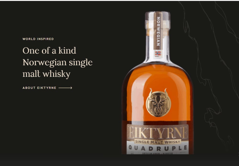
Eiktyrne Whisky is a perfect example of a minimalist e-commerce website. The homepage prominently centers the Norwegian single malt whisky image against a dark backdrop, making it the focal point. Its vibrant color stands out. Meanwhile, the accompanying text provides users with clear options: learn more about the whisky, make a purchase, or explore additional navigation choices via the menu. This design prioritizes the product while offering straightforward pathways for users to engage with the brand.
8. Scrolling Effects
Scrolling effects, animations triggered by scroll actions, have gained significant popularity this year as one of the top web design trends. They are increasingly employed on interactive websites to engage readers, signal transitions in content, and craft immersive three-dimensional experiences. These animations come to life as visitors scroll up or down the page, offering various effects, including element movements, fading transitions, color shifts, and more. Another trending technique, parallax effects, adds depth by moving the website's background at a different speed than the foreground content as users scroll. While these effects boost interactivity, it's crucial to consider their potential impact on users with vestibular disorders.

The PORSCHEvolution website masterfully illustrates the evolution of Porsche cars, spanning from the 1930s Type 64 Racing Coupé to the modern 2021 911. The use of scrolling delivers an exceptionally seamless experience. The accompanying soundtrack, spanning every decade since the 1930s, adds an extra layer of engagement. This combination of visual and auditory elements provides a captivating journey through Porsche's rich history.
9. Pastel colors
Pastel colors in web design are a trendy departure from the usual bold and bright colors. This style has gained popularity recently because it has a knack for creating a calm and soothing vibe for users. Web designers can use pastel colors as the main color scheme or as subtle accents to other design elements. They can also give a website a gender-neutral or sophisticated appearance. However, when using pastel colors in web design, it's essential to consider the contrast between the background and the text to ensure everything is easy to read. Keeping the colors consistent across the entire website is also crucial for a seamless user experience.

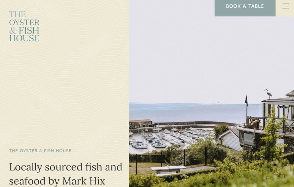
The Oyster & Fish House, a UK-based seafood restaurant, boasts a refreshingly simple yet outstanding website. Pastel colors dominate the site, reminiscent of sand and water, creating a beachy vibe. The standout feature is a wave-like pattern that ripples on hover, evoking the feel of ocean waves. This aquatic aesthetic carries through to the call-to-action buttons and menu sections, which are underlined with a single wavy line, immersing visitors in the seafood experience.
10. Organic Shapes
After the big trend of using geometric shapes and solid grid lines in 2020, there's been a shift towards a fresh web design style – organic shapes. These organic shapes have become incredibly popular among web designers who want to create modern and trendy websites. They create a sense of playfulness and delight rather than structure and order. They're asymmetrical, meaning they don't have any straight lines. Instead, they draw inspiration from elements in the natural world, like rivers, raindrops, mountains, and hills.Organic shapes are fantastic for breaking up different sections on a website without resorting to harsh angles and lines. Done right, they don't mess with the site's information, but give the brand a fresh and innovative look. Plus, they add a touch of personality to the website without taking away from what matters.

Winc Wine Club's website is a standout example of seamlessly integrating organic shapes throughout its site. These shapes are pivotal in strengthening their brand identity, which is all about helping you discover and receive the perfect wines.
Sure thing! You don't have to use all these trends for your 2023 website. That might be a bit much. But even adding a couple of them, either as big features or small details, can improve your site's UX significantly, leading to higher engagement, more CTA clicks, and a better outcome for your online business. And remember, trends are guidelines, not rules. So, don't be afraid to experiment and create your own unique style. Sometimes, that's what makes a website truly exceptional.
Reading time 9 min 40 sec
