What is Shopify Mobile Optimization?
Shopify mobile optimization is the process of optimizing your Shopify store to ensure its seamless usability on mobile devices like smartphones and tablets. It covers improving your store's mobile design and page loading speed, offering smooth navigation and checkout. The main purpose of mobile optimization is to enhance user experience, thereby attracting and retaining more customers and ultimately resulting in higher conversion rates and sales.
Benefits of Shopify Mobile Optimization
Considering the figures mentioned above for mobile traffic and also checkout completion rates for Shopify stores valued at 47.5% on desktop devices and 46.3% on mobile devices, prioritizing mobile responsiveness is indispensable for any ecommerce business.
Here is how Shopify store mobile optimization benefits your store:
- Better user experience: Today's shoppers seek quick access to information, seamless navigation, and effortless transactions via their phones. Mobile optimization ensures your Shopify store meets these expectations.
- Increased conversions: A better user experience, especially on mobile devices, leads to higher conversion rates and sales. Customers are more likely to purchase if nothing disrupts their buying journey, such as slow loading times, difficult navigation, or complex checkout processes.
- Improved search engine rankings: Since 2018, Google has started to use mobile-first indexing, meaning it primarily evaluates the mobile version of a site to determine its ranking. A mobile-responsive Shopify store is expected to rank higher in search results, increasing visibility and attracting more potential customers.
- Competitive advantage: With mobile optimization becoming standard for ecommerce, a mobile-friendly Shopify store gives you a competitive edge by meeting the needs of modern shoppers and keeping you aligned with industry standards.
The best way to optimize the Shopify site is to use a mobile-first approach. It means you make your design first and foremost with mobile users in mind. Here are some of the best mobile optimization practices to implement on your Shopify store:
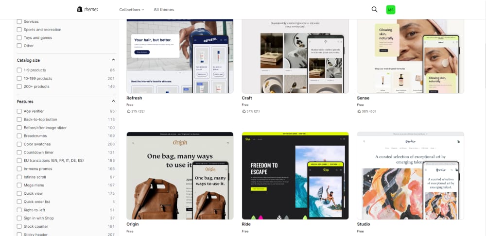
1. Choose a Responsive Shopify Theme
Choosing a mobile-friendly theme is a fundamental step in ensuring a positive mobile experience for your Shopify store visitors. A responsive theme will automatically adjust to anyscreen size, ensuring your store looks great on smartphones, tablets, and desktops. And while most Shopify themes are responsive, some may require additional customization to be fully mobile-friendly, especially if you're adding custom features, scripts, or third-party apps. Keep in mind that extensive theme customization can slow down your store as each new customization often adds more code, potentially impacting load times and your site's overall performance. The best choice is a theme with a simple, clean design, as cluttered layouts can overwhelm mobile shoppers.
2. Simplify Your Navigation
Using responsive themes is great, but there are many other things you can adjust to make your online store mobile-friendly. The next step would be simplifying your navigation menu. As mobile users don't have the luxury of large screen space, for their seamless shopping experience, it is important to adjust the navigation menu and make it easy to use on a mobile device. Keeping your Shopify mobile navigation compact and simple can help visitors find what they want quickly and encourage them to stay on your site longer. In most cases, placing a small hamburger menu icon at the top of each page is the best way to customize your mobile site's navigation. This simple design provides access to various navigation options while keeping your site clean and clutter-free. The menu remains hidden until visitors decide to explore it, creating a seamless browsing experience. Once the menu opens, avoid overwhelming visitors with too many categories and options. Instead, try eliminating or combining some menu items.
Additionally, optimize your Shopify store's mobile search. An efficient search function is vital for helping users find products quickly on their mobile devices. Ensure the search bar is prominent and easy to access. Consider using an icon or a magnifying glass to signify the search functionality. Implement autocomplete suggestions in the search bar. Consider integrating voice search functionality, allowing users to search for products by speaking into their mobile devices.
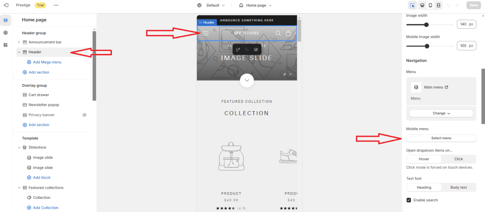
There are many Shopify themes available that allow you to have different menus for the desktop and mobile versions of your store, each with its advantages and disadvantages. From your Shopify admin dashboard, go to Online Store, Themes, and сlick on the Customize button next to your active theme. In the theme customizer, you'll see various sections in the left-hand sidebar. Look for an option related to the Header. Select the Header, and on the right side, you will be able to select the type of the menu and its options for mobile. The Mobile menu section may vary depending on the theme you're using. To adjust the items in your mobile menu, go to Online Store > Navigation in the Shopify admin.
3. Reduce Page Load Times
Improving your website's speed, both its mobile and desktop versions, is crucial for better user experience and SEO. However, mobile users are even more reluctant to wait and are more likely to abandon a site if it takes too long to load. Google generally recommends that a mobile site load time be under 3 seconds. Additionally, Google uses page load time as one of the ranking factors, meaning faster-loading websites are more likely to rank higher in search results.
Here are some top tips to cut down your website load times and boost performance:
Simplify design: Overly complex designs take a longer time to load, so keep things simple yet visually appealing.
Optimize images: High-resolution images look good but can slow down your site. Ensure images are not larger than necessary before uploading. Use compression tools to reduce image file sizes without sacrificing quality with tools like TinyPNG, JPEG Optimizer, or Shopify apps like Crush.pics. Use JPEG for photos, PNG for transparency, or modern formats like WebP for smaller file sizes
Enable browser caching: Caching reduces server requests by storing static files locally on the user's browser, resulting in their reloading faster next time. Shopify already has built-in caching mechanisms, but this recommendation is relevant for those who are adding custom elements. If you're adding custom code, you can ensure efficient caching by using cache-control headers in your HTTP requests.
Implement above-the-fold content techniques and lazy loading: Load important content to give users a sense of progress while the rest of the page loads. You can inline critical CSS for above-the-fold elements in your Shopify theme.liquid file to reduce the time it takes for these elements to render. Additionally, use lazy loading for images and videos so they only load when visible on the user's screen, reducing page load time and saving bandwidth. Shopify themes generally support lazy loading natively. To check if your theme does, open the theme.liquid file and verify if the loading= "lazy" attribute is present in image or video elements. If not, manually add the loading= "lazy" attribute or install a Shopify app like Lazy Load to automate the process without manual coding.
Minimize the number of apps running on your store: While Shopify apps enhance your store's functionality, they can also introduce extra code that may slow down performance. Periodically review and remove apps you no longer use or that duplicate functionality. Prioritize the apps that are essential to your business.
4. Optimize Checkout for Mobile
Mobile optimization is critical when it comes to the checkout process. After all, a beautifully designed responsive website is of little value if customers can't successfully complete their orders. Shopify generally offers a mobile-friendly checkout that simplifies the buying process for mobile users by default, but merchants can still enhance it even further this way:
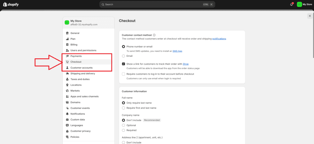
Use Shopify's optimized one-page checkout. Reduce the steps needed to finalize the checkout process. Each additional step increases the chances of users abandoning their carts. To use Shopify's optimized one-page checkout, you simply need to enable and customize Shopify's default checkout process, designed for simplicity and efficiency. To do it, go to your Shopify dashboard, and in the left-hand menu, click Settings at the bottom. Then select Checkout and Accounts from the settings menu and customize according to your needs. Display order details, including a summary, shipping and payment information, and the 'Place Order' button. Remove distracting features or links that might confuse or divert your customers.
Implementing autofill for forms: Address and other forms autocomplete enhances the overall mobile experience, freeing users from filling them during checkout and reducing user effort and friction. Shopify's default checkout already supports autofill for contact, shipping, and payment information fields. If you're creating custom forms (e.g., for lead generation or newsletter signup), you can manually add autocomplete attributes to your form fields.
Offer guest checkout options: Enable guest checkout so users don't need to create an account to make a purchase.
Enhance Trust and Credibility: Integrate trust signals, such as security badges, payment gateway logos, and customer testimonials, to build trust and motivate customers to complete their purchases. You can manually add badges and payment method logos (typically available for download from the payment provider's website) in the Theme Customization section, specifically within the Footer or Checkout settings, or install an app like Trust badges & icons ‑ conito to add badges and patent icons to your store.
Mobile payment options: Shopify stores have access to mobile-first payment gateways like Apple Pay and Google Pay, which offer a seamless, one-click checkout process tailored to mobile users. These payment options are directly tied to Shopify's payment gateway. To activate Apple Pay and Google Pay on Shopify, go to Settings > Payments in your Shopify admin, click Manage under your credit card payment provider, select Apple Pay in the Wallets section, and then click Save. If you meet Apple's requirements, Apple Pay should appear automatically as an option during checkout on supported devices, even without its manual selection.
5. Use Clear Call-to-Action (CTA) Buttons
Effective CTA buttons are crucial for guiding users through the purchasing process. As mobile and desktop experiences differ in many ways, the way your site visitors act also differs. Your call-to-action design should be adjusted to their mobile user experience. Test different button placements and designs to see how they appear on screens and what works best for your audience. You can add and customize the desired CTA through the theme editor, manually edit the liquid code in your theme, or use a Shopify page builder app. These apps allow you to add CTA buttons without coding. For instance, you can use Shogun, a popular page builder that allows for easy design of landing pages, product pages, and customizable CTA buttons.
To further optimize your call-to-action button for mobile sites, consider the following:
Ease of reach: Keep CTA visible and easy to find.
Size and tapability: Make sure it's large enough for users to tap with their fingers without accidentally activating nearby elements.
Contrasting colors: Use contrasting colors to make it stand out.
Clarity of action: Clearly communicate the action associated with the button. Keep the text short and actionable (e.g., "Buy Now", "Add to Cart" or "Sign Up").
6. Prioritize Touch-Friendly Design and Readable Fonts
Mobile users navigate with their fingers, so it's important to ensure buttons and links are large enough to tap easily, as no one likes zooming in to tap a button. The highest accuracy was found for buttons between 42 and 72 pixels in size. Android Material Design Guidelines advise a minimum of 48x48px. So, ensure the buttons are large enough to avoid misclicks. Text readability is another crucial factor for delivering a positive user experience on mobile devices.
Here's how to optimize fonts and text:
Appropriate font size: With the limited space of mobile screens, your font should be large enough to be easily readable on small screens. Test different sizes to find the optimal balance between readability and aesthetics.
Contrast: Guarantee ample contrast between text and background colors. It is particularly important for users viewing your site in varying lighting conditions.
Whitespace: It's also important not to overlook whitespace usage to improve text readability. Whitespaces help break up content into digestible chunks, making it easier for users to scan through quickly on the go. Avoid clutter, as crowded elements can make the content hard to read, lead to frustration, and cause users to leave.
Minimize the use of pop-ups: Pop-ups are a great way to capture visitors' attention, which helps increase email subscribers, notify them about sales, remind them about cart abandonment, and many more. However, excessive usage of pop-ups can be intrusive and irritating, especially on mobile, and negatively impact the mobile user experience.
Consider the amount of text carefully: Use shorter paragraphs, bullet points, and concise headings to make the amount of text suitable for a mobile site. Avoid using large blocks of text and unnecessary details. Focus on providing the most essential information.
7. Test and Analyze
Regularly monitor your store's performance. Use tools like Google PageSpeed Insights and Shopify's built-in reports and analytics. They provide insights into areas that need improvement, such as page load times, mobile-friendliness, and other performance metrics. Let's break it down in more detail:
Check your website speed: Run your site through Google PageSpeed Insights and check speed via Shopify's own performance monitoring tools, Online Store Speed Report, within your Shopify admin. Both tools provide insights into your website's performance and speed on both mobile and desktop devices. They also provide specific recommendations for optimizing your store's speed and loading times.
Set up Google Analytics or Shopify Analytics to track mobile-specific metrics. Use Google and Shopify Analytics to monitor site traffic, conversions, and user behavior. Check one of our recent blog posts on how to use Shopify Analytics here.
Use cross-browser testing tools: Before rolling out changes, always test your Shopify store on multiple mobile devices, both iOS and Android. Try using a browser emulator to check your site's appearance in different browsers. Check out our blog post on the best cross-browser testing tools here.
Run A/B tests: Test different mobile layouts and features to see what drives more conversions, engagement, or other key performance metrics. Tools like HubSpot A/B Testing can help you automate the test process, track user behavior, and analyze the results.
Bottom Line
As mobile shopping becomes the dominant way to make purchases, optimizing your Shopify store for mobile is crucial to its success. The best way to optimize the Shopify site is to use a mobile-first approach when designing it. The list we provide above isn't exhaustive, but it is good to start with. By choosing responsive themes, improving load times, and optimizing design elements like product images and font sizes, you will be able to offer your customers a more mobile-friendly experience.